Oct 2019 - Dec 2019 (6 weeks)
Transportation in Pittsburgh
Storytelling with data

DESCRIPTION
The "storytelling using data project" is part of the course Communication Design Studio taught at Carnegie Mellon University. Which story you wanted to tell was open for each student to decide individually. Personally I was interested in exploring how transportation infrastructure defines the 93 neighbourhoods of Pittsburgh. Being from the Netherlands where public transportation is widely used and accessible for most demographics I was curious to find out if there is a relationship between the accessibility of a neighbourhood in Pittsburgh and average income.
SKILLS USED
Data visualisation Data analysis Communication Design Screen Printing
User Interface Design Storytelling
Outcomes
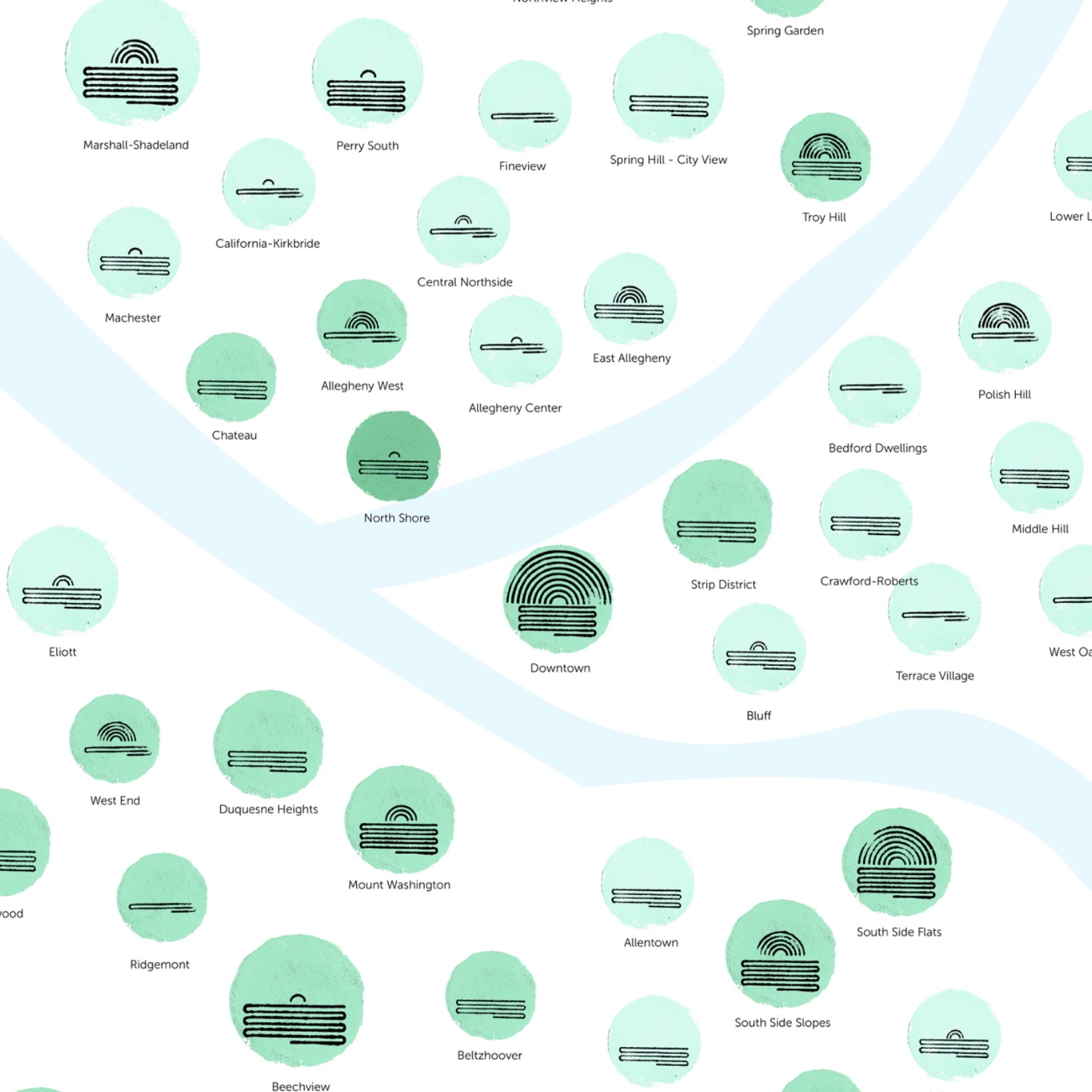
My personal goal for this project was to not just make a static data visualisation that just broadcasted information like a one way street, but one where the targeted users could interact with the information provided and take part in a feedback loop. Allowing the policy makers of Pittsburgh to improve their infrastructure according to the needs and wishes of the population. Therefore, I decided to have a digital and physical component to my data visualisation.
To make the visualisation I created 18 stamps and screen printed the layers onto paper after which I scanned them using a High Resolution scanner to be able to digitalise them. Users can browse through the information digitally and provide feed back by stamping the way they wish their neighbourhood looked like.


PROCESS - DATA
I defined the accessibility of a neighbourhood by looking at the number of bus stops, number of streets, number of bridges and number of healthy ride stations. One of the main challenges I faced was how to overlay the different information of the neighbourhoods so that there is richness to the information presented, but not information overload. The following image show how I decided to build up my data visualisation.


Using a cartesian coordinate system, I plotted the 93 neighbourhoods, with the type of transportation on the x-axis and income on the y-axis. Looking at these graphs you can see that if the number of bus stops increases, the average income goes down. Additionally you see that if the number of bridges goes up so does the average income. What I also found was that if a neighbourhood has a high number of streets the average income is higher. The same goes for bike racks — the higher the number the higher the income.


PROCESS - MAKING
Try 1: stamp result when laser cut directly into wood

Try 2: stamp result when laser cut into linoleum


Lasercutting process: left the files, right during cutting


Mixing paint


Take a look at my medium blog I kept updated during the project for the detailed process and personal reflections.